Green & Holographic
This blank notebook with heavy, textured paper was my first real foray into using foil in my bookbinding. I used holographic foil because I knew that no matter what I did, holographic foil would always look totally rad.
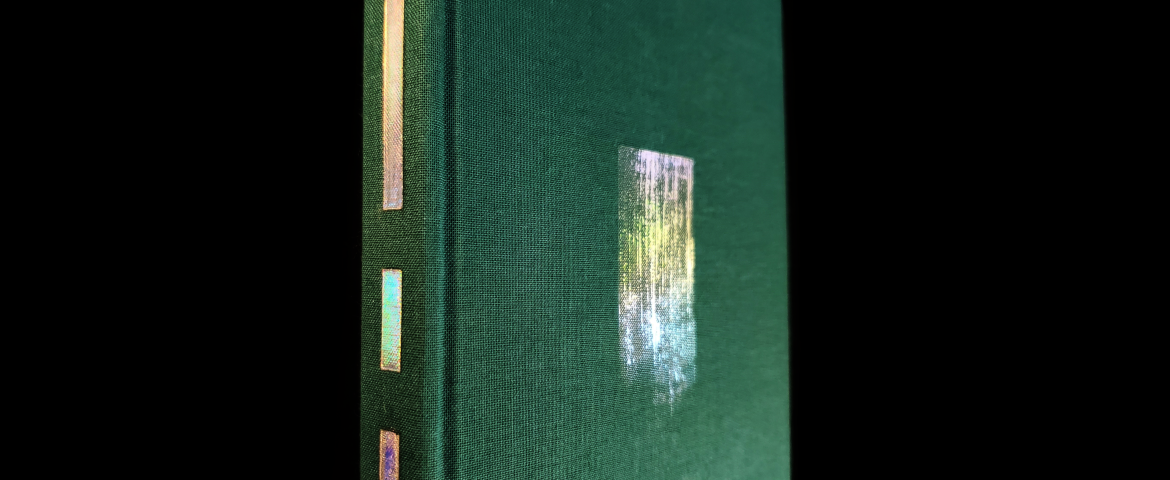
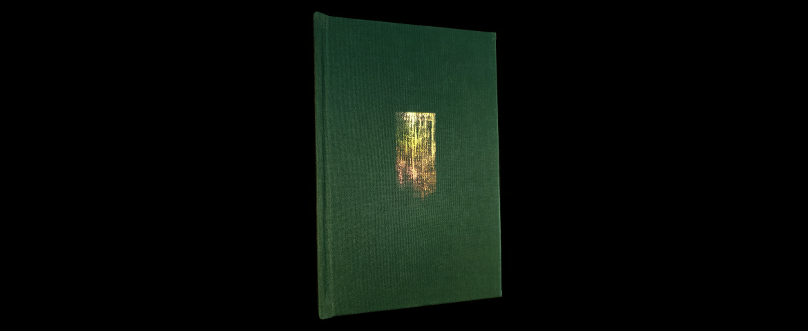
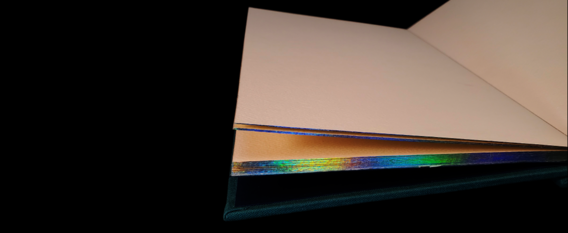
That's only partially a joke - the foil really carries a lot of the onus of visual interest. The green bookcloth complements the colors in the foil nicely without being obviously neutral, and even the relatively small amount of foil used on the cover, in the form of a deliberately sparse brush stroke, draws the eye right away. Technically, I like the spine decoration, which I accomplished by simply masking the outline of the to-be-foiled areas with tape and applying foil over the whole length, but visually, it slightly undermines the understated vibe of the cover and even the edges. Seen from certain angles, you might miss the foil on the edges or the cover completely, but the hard edges on the spine tends to stand out more.
Using heavy, textured stock for this notebook enables it eventual use with various media, which naturally appeals to my multidisciplinary tendencies (though I may not be the one to eventually fill it), but even more practically, it offered a lot of real estate for the foil to grab onto at a point when I was still developing my application technique. A common problem when gilding or otherwise applying decoration to edges is the finish flaking off; when I used the wrong adhesive or treated it improperly in my materials tests, the foil could flake or even peel off in chunks (never a good phrase to hear), and it would be especially noticeable over thinner paper because more sheets would be affected. The heavy stock is a win-win between functional intent and ease of production.
I strongly intend to explore the potential of capturing brush strokes, as on the cover, and the combination of holographic foil over relatively neutral cover materials in future work.


