Mid-century Inlaid Notebook
Other Works
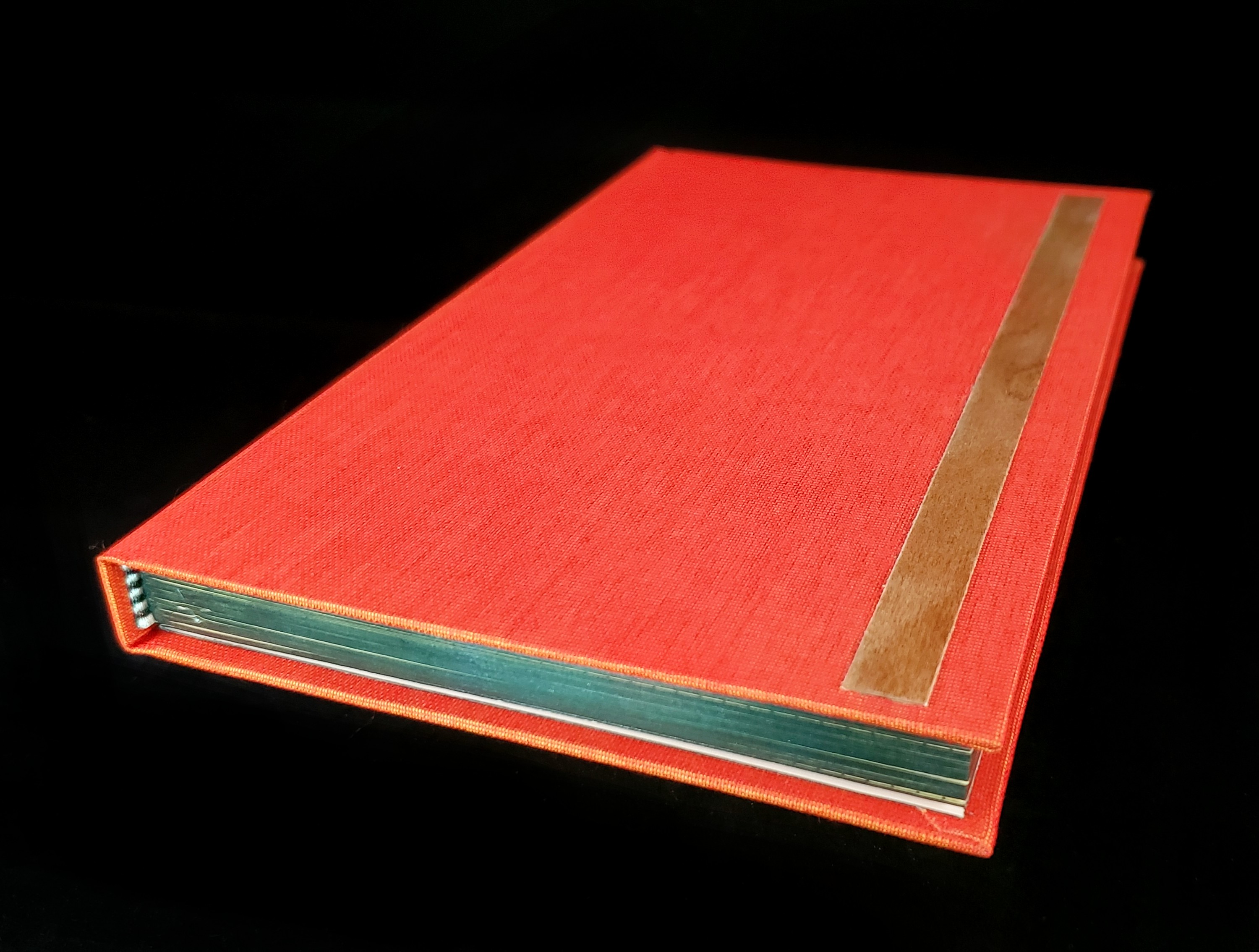
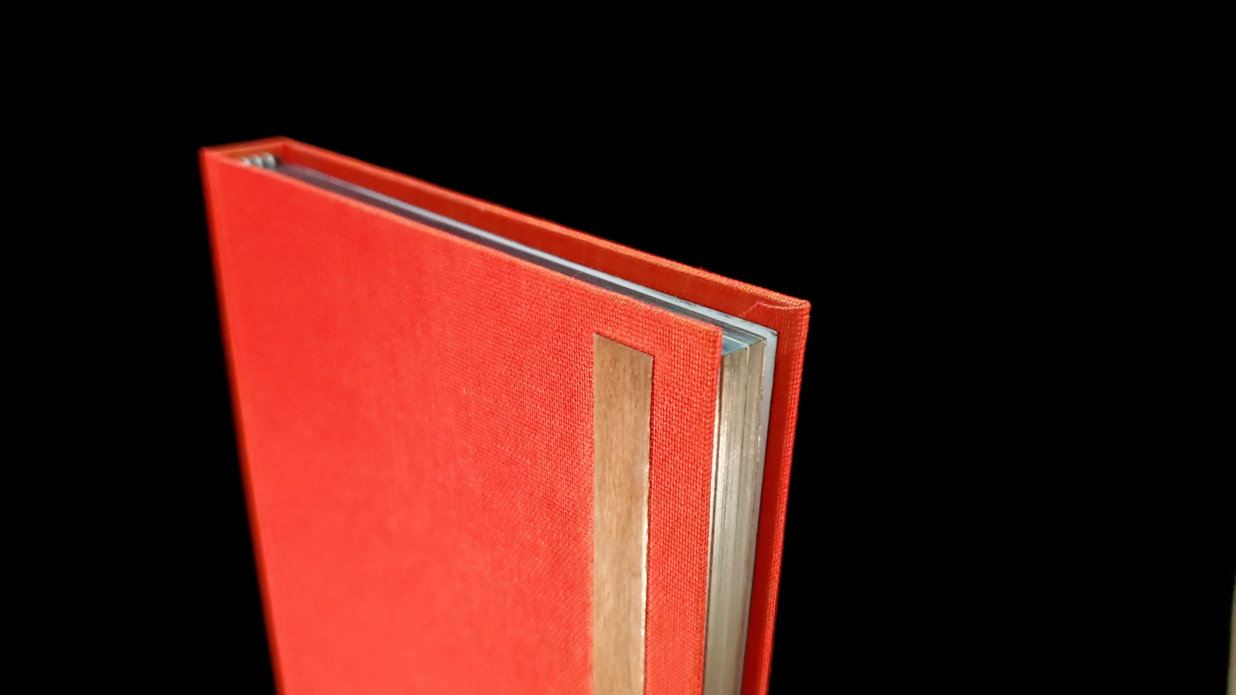
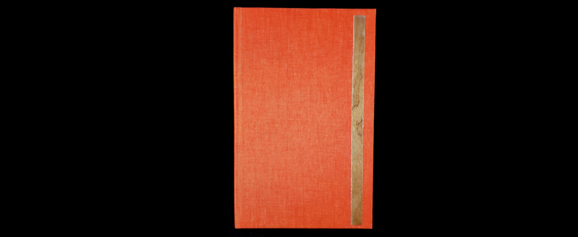
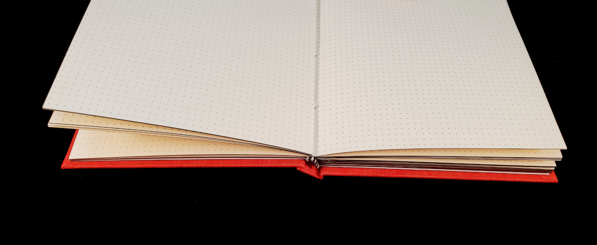
This notebook features dotted paper - a personal favorite - on fairly heavy cream-colored stock, a cover of a delightfully color-shifting orange bookcloth, and a rather understated inlay of maple veneer. I'd tried my hand at inlays a fair few times by this point and felt confident enough to really lean into the materials; the maple strip is finished with cyanoacrylate, sanded to 2000 grit, and polished with beeswax - not quite enough to see your reflection in, but it makes for a beautiful gleam in the light and a soft, almost satin feel.
The edge on this was a real treat for me; it was a totally new process that took tons of trial and error, so I naturally had a blast. It's a polished graphite edge, which has plenty of historical precedent that I had never heard of. I clamped the text block and sanded it as smooth as I could get it; the smoother it gets at this stage, the better. I made a mixture of water, PVA glue, and graphite powder (buy it from any artist supplier, shave the tip of your pencil with a razorblade, or use lock lubricant, which is just powdered graphite!) in proportions I completely failed to record, but the glue was by far the most scant ingredient. I then wrapped my finger in a coarse (but not as coarse as terrycloth) rag, picked up a bit of the mixture, and began working it in. It went on best with fast, long strokes of medium pressure, but if you try this at home, be warned that it looks like you're ruining your nice smooth edge for about 90% of this step. Eventually something catches, or the glue starts to set, or the water begins to evaporate just so, and the finish evens out. The biggest challenge was having to do one area and then the next; anywhere the fresh mixture overlapped the finish that I had previously applied, the nice finish went right back to the 90% of the process that looks terrible. But as before, persistence and only persistence paid off here. Once the new section caught on, I was able to get an even finish.
After the graphite was applied, I took an agate burnisher to it. This step was deeply satisfying and I found on the next two edges I kept rushing the application just to get to the burnishing, which got me in trouble. Thankfully, at any point, the graphite edge can be scraped off and the process restarted.

It was this notebook that jogged my analytical brain hard enough to realize what I'd been up to. I've always wrestled with the distinction between art, craft, and design, and have often felt it was a Sisyphean thought process. I'm drawn to simple, bold designs like this long rectangular inlay, but when I give into them in my own work it feels insufficient, hack-y, like a teenager discovering the conceptual application of the word "deep" and thinking it could be worth applying to every little thing. I didn't struggle with the drafting, the expression of it, I didn't have novel philosophical ideas and symbolism driving every aspect, so surely it couldn't be "ART"?
When, as I said, this notebook jogged my brain, it was in spending hours sanding and polishing that little strip of wood. It's a ridiculous pursuit, looked at animalistically: spending time and energy, straining muscles and joints to make this fragile little thing shiny to put on the cover of a blank book. I have some ingrained guilt from my love of wood (sorry for the pun) as a visual material for similar reasons. It can feel very low-effort - to me as an artist, as well as to audiences - and I fear that devalues my creative decisions. But the love that I finally noticed had been there the whole time, motivating these choices and preferences, was a love for texture and for small things. The love that you notice again after so long when you go to a new place and actually look up when you walk down a street, or run your hand along the arm of a favorite chair and really take the time to notice how it feels, and not just keep taking it for granted.
Simple visual forms leave fewer avenues for these connections to be mired in the symbolism or representationalism whose absence in my own work I have to continually stop myself from lamenting. It's okay to see beauty in something that wasn't purposefully made so . . . maybe, come to think of it, it's even better.


